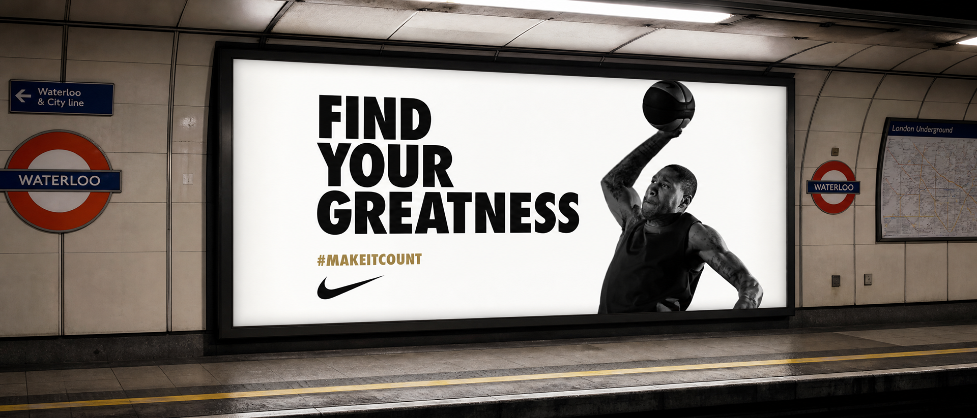
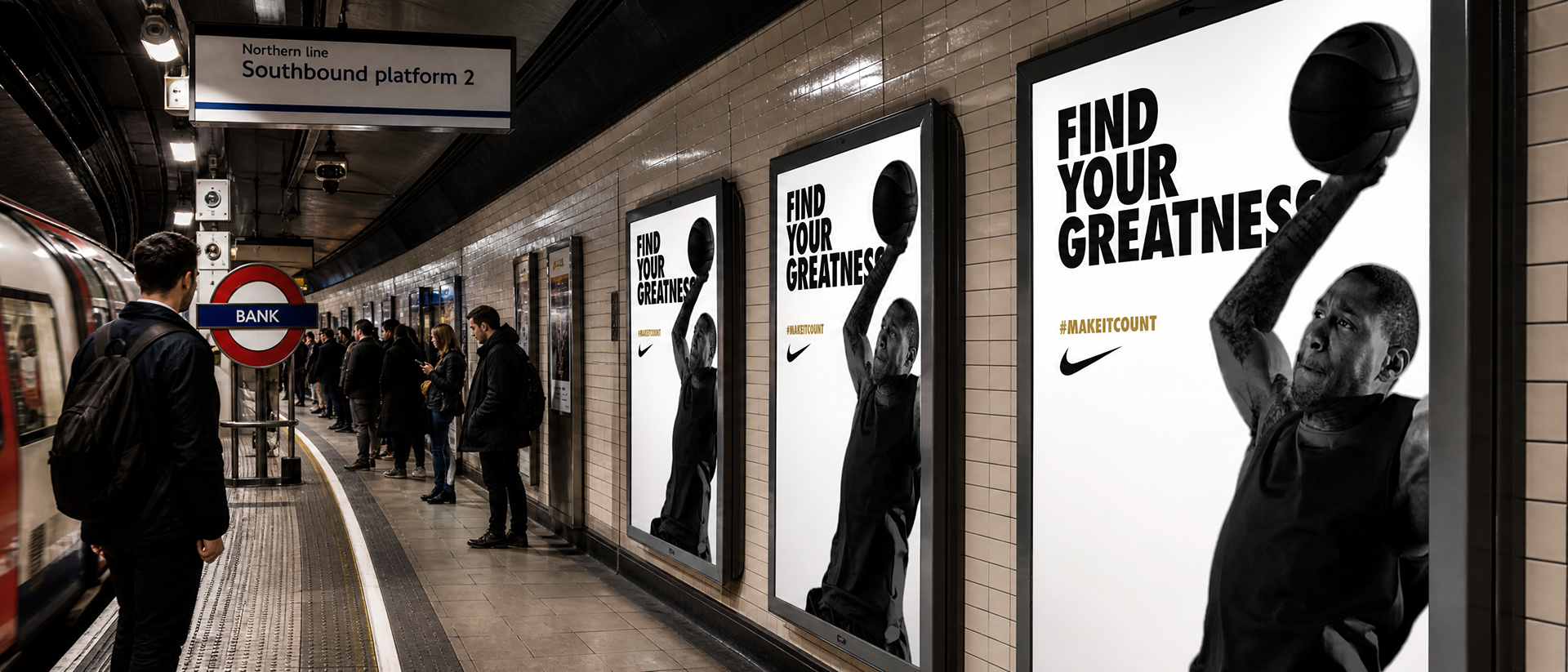
Nike needed a presence inside the London Underground for the 2012 Olympics.
The brief: wrap the escalator experience around the athletes, turning a daily commute into something worth watching.
The production constraint was real. Elite athletes don't hold their schedules for shoots. Several couldn't be filmed on the same green screen stage, and some weren't filmed on green screen at all. That meant the post-production treatment had to do what the production couldn't: make everything feel like it belonged together.
The solution was a graphic system built to absorb inconsistency. A bold, high-contrast visual language that didn't rely on matching backgrounds or identical lighting conditions to feel cohesive. It unified footage shot across different setups, locations, and conditions into a single kinetic world that lived on the escalator panels and moved with the commuters riding past it.
I also developed a standalone, single-unit version for static display locations within the stations, extending the campaign across the entire underground environment.
The medium is the message. Escalator panels aren't screens people choose to watch. They're surfaces people pass at a fixed speed, in a fixed direction, with no ability to pause or rewind. Designing for that constraint means every frame has to land in motion, across a sequence of panels, read by someone who isn't stopping. The athletes running alongside commuters as they ride down isn't a nice metaphor. It's the entire mechanic, and it works because the format and the content are doing the same thing at the same time.
Constraint became the creative idea. The inability to shoot all athletes on a unified green-screen stage could have resulted in a visually inconsistent campaign. Instead, it pushed toward a graphic treatment bold enough to override those inconsistencies. High contrast, graphic isolation, and a visual system strong enough to hold regardless of what the source footage looked like. The limitation didn't weaken the work. It's the reason the aesthetic exists.
It's Nike on an Olympic scale without shouting. The 2012 London Olympics were one of the most heavily branded events in UK history. Standing out in that environment required restraint as much as ambition. Putting athletes in the everyday commute, inside a very London piece of infrastructure, made the campaign feel embedded rather than imposed.
The standalone unit proves the system. A campaign that only works as a panoramic escalator takeover is a one-trick execution. Building a single-unit version that holds the same visual logic, the same energy, and the same impact at a fraction of the scale shows that the idea was genuinely systematic. That's the difference between a production and a platform.
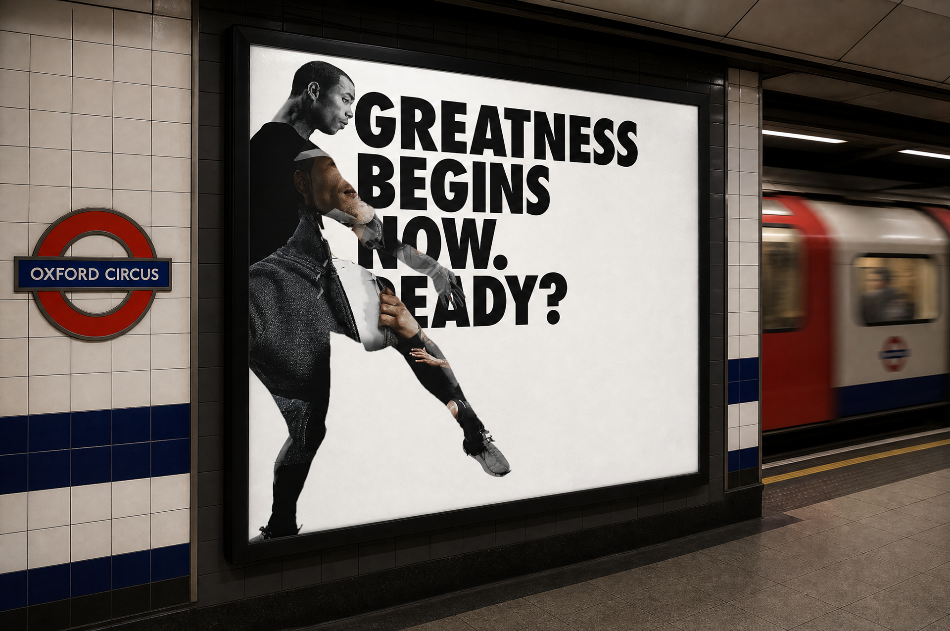
Stand-alone units within the station.